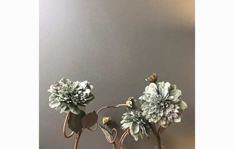
With more than two decades and located in the center of Porto, this hotel is cozy and has the constant concern of making us feel at home. Each season is special and a reason to renew the floral arrangements.


With more than two decades and located in the center of Porto, this hotel is cozy and has the constant concern of making us feel at home. Each season is special and a reason to renew the floral arrangements.
With more than two decades and located in the center of Porto, this hotel is cozy and has the constant concern of making us feel at home. Each season is special and a reason to renew the floral arrangements.
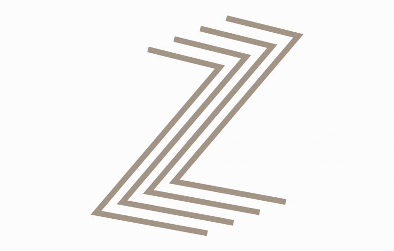
Located in the center of Porto, on Zambeze Street, the apartment building was named after the same name. We sought inspiration in the curves of the Zambeze River to create the branding of this building, drawing 4 parallel lines (4 floors) in dynamic and rectilinear movement for a modern look. In the same space there is a family house with particular characteristics and several possibilities for exploration, which we called Houze (changing the original word House to association with the Z in Zambeze). We developed illustrations representing various professional activities to demonstrate Houze’s universe of unlimited possibilities.
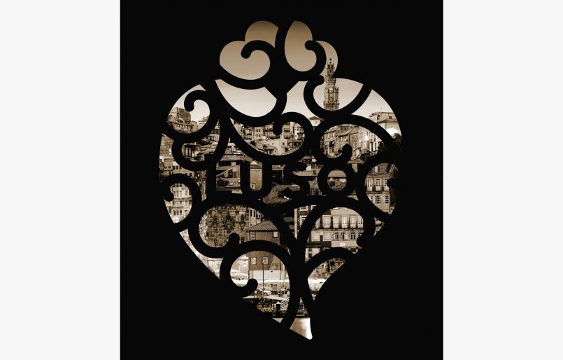
Café Luso has been in the heart and history of Porto since 193, being a gastronomic reference for all Porto residents, tourists and public figures linked to art and culture. To keep its connection to the city’s cultural history, Luso transforms itself each season, wearing the colors and dynamics of festivities or days of celebration. It is with pride that we collaborate with the Café Luso team, recreating its storefronts bearing in mind the motto of the brand: people first, close to the heart.

We developed a creative concept for a workshop bar for customization of jewelry and watches in the store. From the counter and the high benches, bottles for placing accessories, to the employee’s uniform, all the details indicate a differentiated service.
A second study was developed for a corner outlet in one of the Bluebird stores.
As a company committed to the training of companies and teams through the management of a positive change, Dynargie is genuinely concerned with people and the way it communicates with them. For several years we have been challenged to find original solutions to exhibit their products at Expo RH, through actions and stands that engages the visitors in an original way.

Going through a complex process of joining several laboratories, the company wanted to communicate confidence to all employees, assuring them their importance for the change. We developed a communication identity based on the deconstruction of the name Unilabs to INU, meaning, “The strength to change is in you”. The project included space decoration, infographic communication, gift personalization, street and company actions, video and animations. The extremely demanding development deadlines earned us recognition through the Mission Impossible Award, for our quick and efficient response.
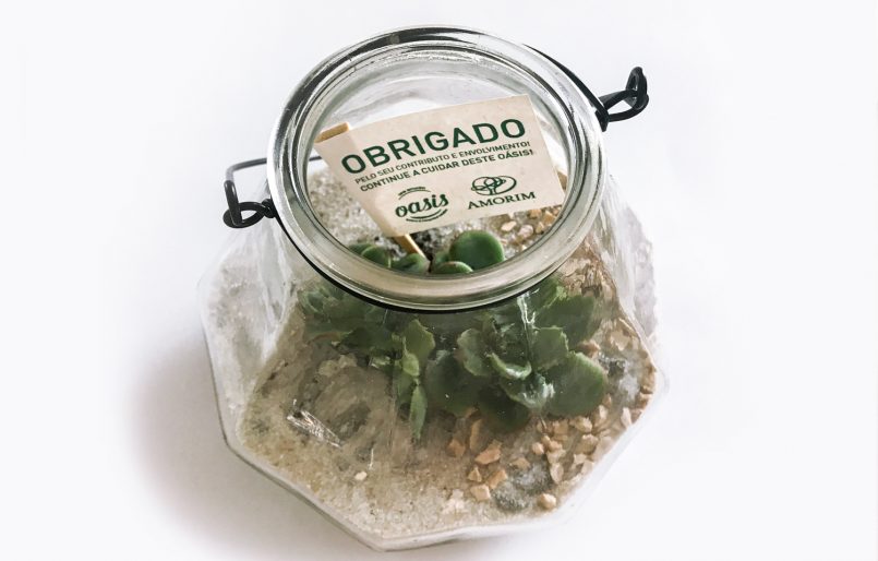
Amorim & Irmãos started, in April/18, a project to change its computer system called OASIS – One Amorim System & Integrated Solution. Our goal was to communicate the importance of this project to all employees of the group, through actions that arouse the interest and involvement of all.
The Oasis illustration is an artistic representation of this collaborative spirit in which unity is strength, moving mountains and, literally, trees. The cork oaks represent the basis of the work, with its strong roots embedded in the earth and a strong canopy. The faces of the workers are born in the tree trunks while the foliage draws their expressions and hair. This fusion between the base of the tree that generates cork and the human element, interconnected in an inseparable complicity, represents the proximity between the product and the necessary collaboration between people: the true motivating force of the project, essential to OASIS change.
In addition to the oasis of real cactus and sand to be cared for, just like the project, we developed communication actions through the use of targets representing Consistency, bottles for Influence, clapping for Proximity, among others.
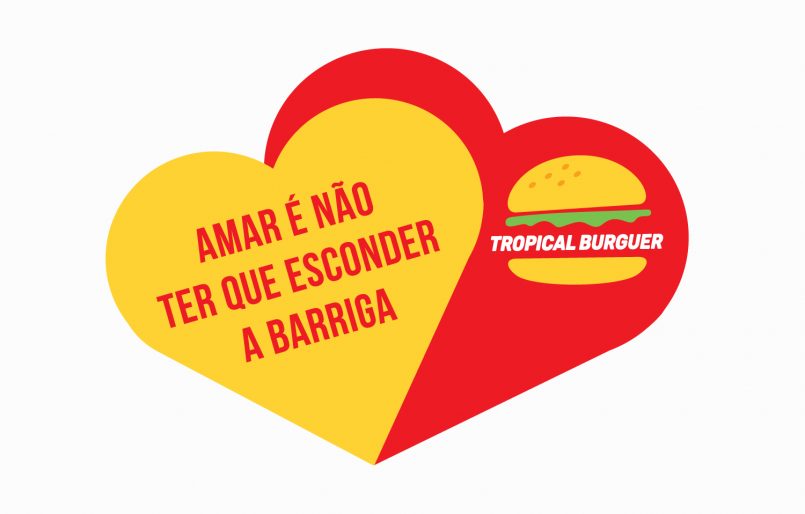
Tropical Burger is proud to have the most genuine hamburger of Porto, prepared by hand and with the freshest ingredients. The brand communicates clearly, with lots of color and high spirits, appealing to share tasty moments.
This restaurant is located in a sports center and surrounded by trees that inspired the creation of the brand’s image. By association with the earth and nature, we chose light green and brown tones, developing all the decoration and accessories with natural wood. For the furniture we created open and straight boxes, using the same style for a dividing wall in the space; the menus have a wooden board, the olive jars work as a box for the bill and the gifts are personalized wooden spoons.