TYPE IS WHAT MEANING LOOKS LIKE.
Robert Bringhurst
As designers, we are the ones who determine how we convey a message, whether by using an image or text. It is true when we say that a picture is worth a thousand words, but it is equally correct to say that a sentence is worth a thousand images. The quality of the content is fundamental, but it is very important to know how to bring the text to life and this is where we designers have a lot to say. To make a message appealing, we combine fonts, colors, sizes, alignments and word positioning. We have summarized some rules for the effective use of words in written communication:
Character
When we meet someone, we take the “pint” out of first impressions, and almost immediately we are able to assess whether we like the person or not. However, we cannot or should not always judge the book by its cover. The typography works in the same way: when we think something is not right, we have to deconstruct and build again until we can give personality to the message! Each one of us communicates in his own way and screams differently, the same goes for the sources, we just have to give them a different format to obtain countless variants.
Unforgettable
There are people who are part of our life, who are fundamental, but who are almost imperceptible. The same happens with the sources, if we do not realize that they are there, it is because they are well applied. In situations where we look at a message and what is most evident is the font, which ends up distracting us from the main message, we assume that something is not right. The message must be as clear and perceptible as possible, in any type of environment in which the source is inserted.
Meaning
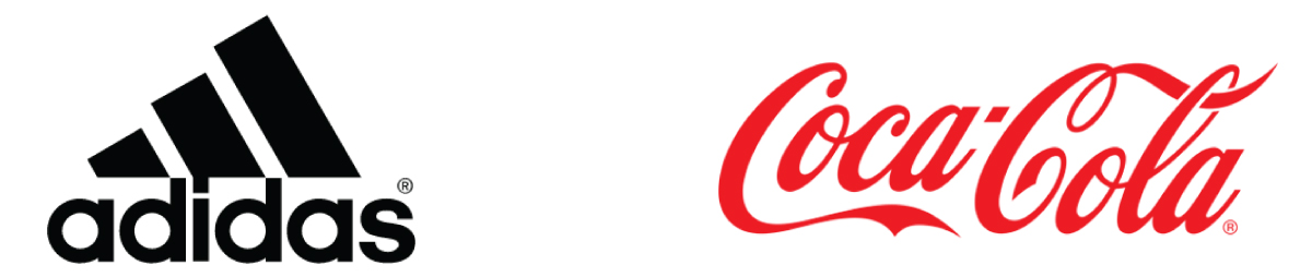
The choice of a font should not be influenced by momentary popularity. It must be decided taking into account the meaning and the creative and commercial purpose of the brand. An excellent example of this is Coca-Cola, Nike or Adidas, timeless brands, which if they had chosen to use Helvetica or Arial in their logo, certainly today would not be so successful.
Versatile
Being more digital influences the way we consume information, with more and more content being transmitted through screens and mobile devices. This leads to the need to understand whether the typography we use in printing works the same way on different platforms and screens.
Direct
Whatever the language in which it is written, the typography linked to a universal image ends up not needing many explanations. Transmitting a clear, simple and direct image, in addition to saving the user time, will certainly be in everyone’s memory.
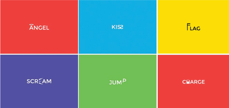
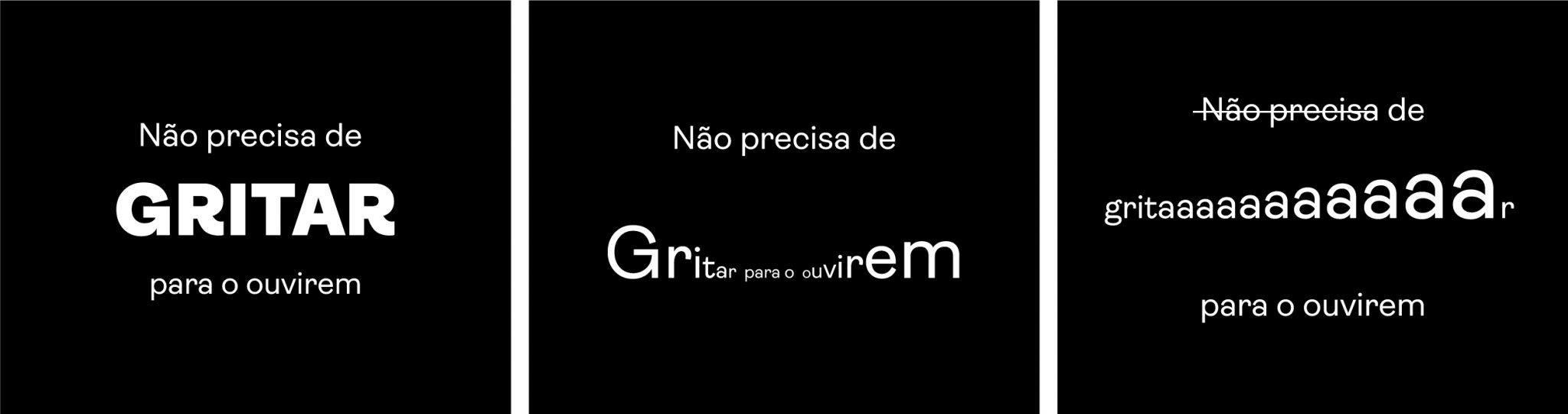
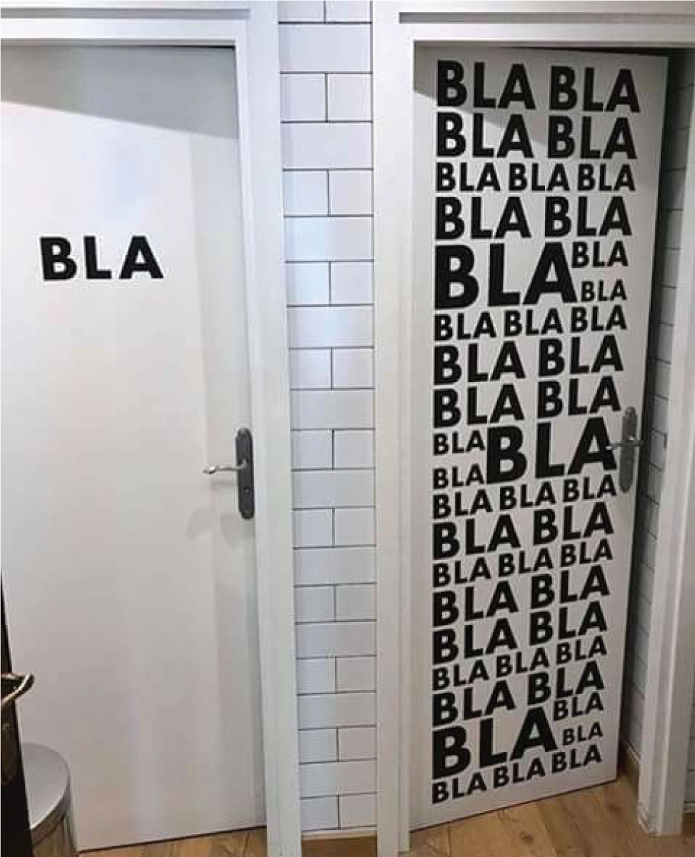
Fun
Behavior is a general language perceived by every human being. Therefore, describing it with typography can be an incredible way to be able to communicate effectively, playing and giving the meaning it well deserves. In the image below we leave an example of a simple idea, easily understood by your client. Therefore, use and abuse the fonts, which well combined can bring a great visual advantage to your work.
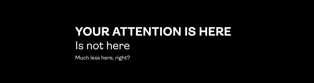
Hierarchy
Choose what you want to be more evident. When fonts with the same visual impact are used, you are not highlighting any particular information and therefore you are unable to get the right message to your customer. Using the upper case and the “bold” may be a chance to communicate correctly.