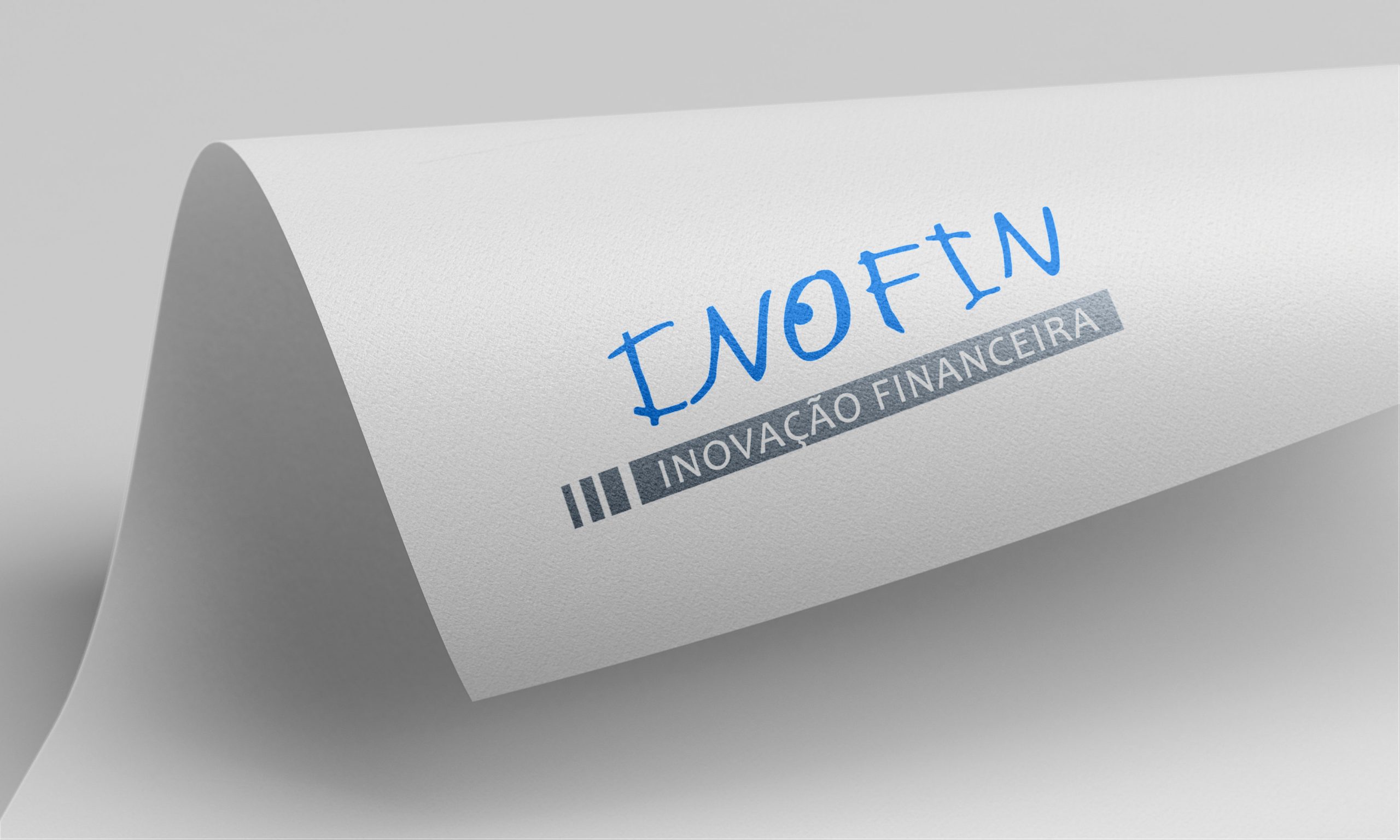
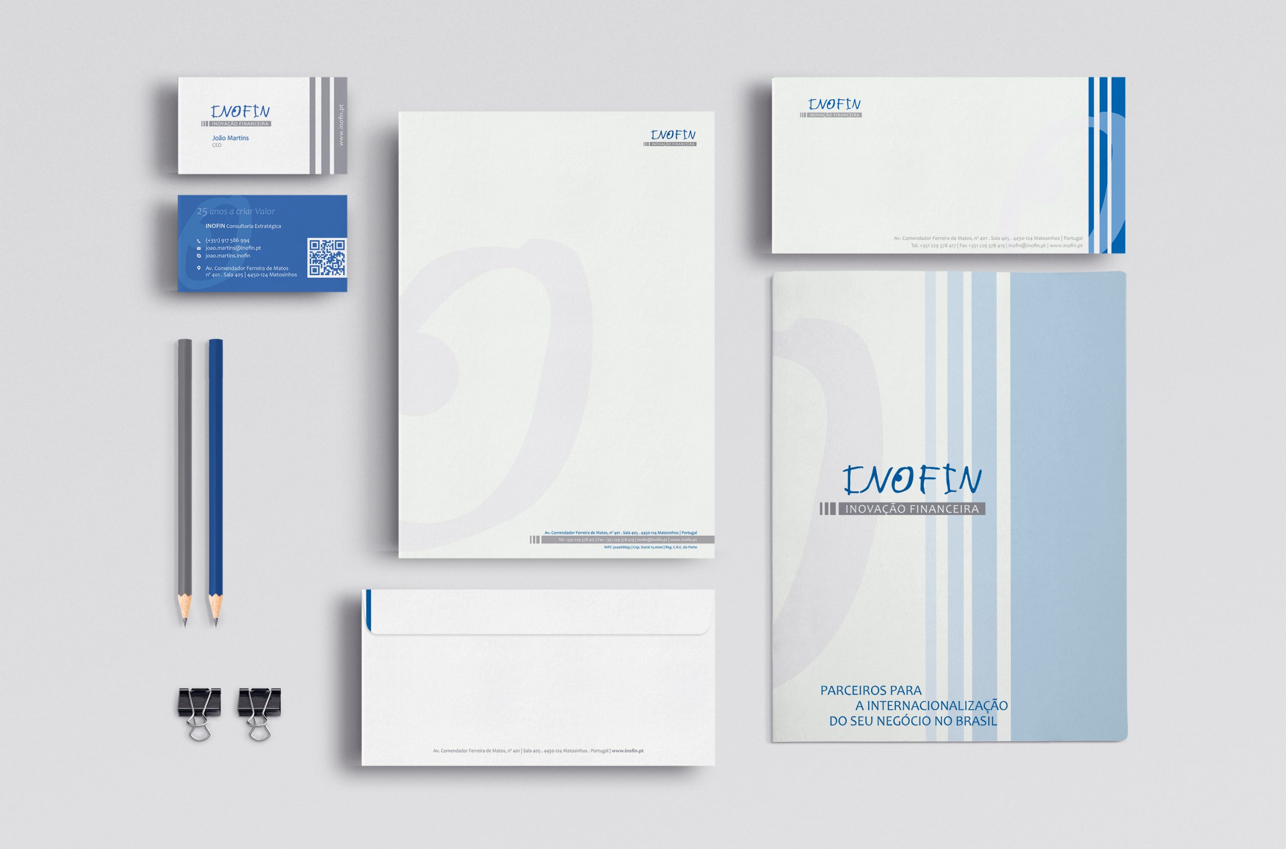
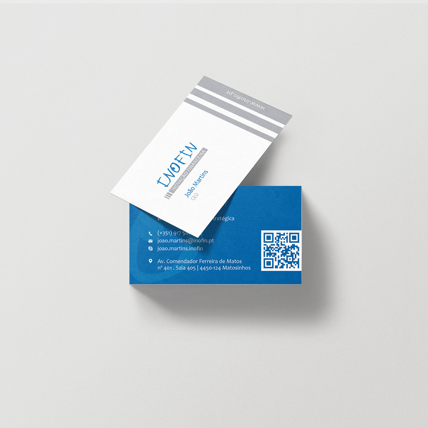
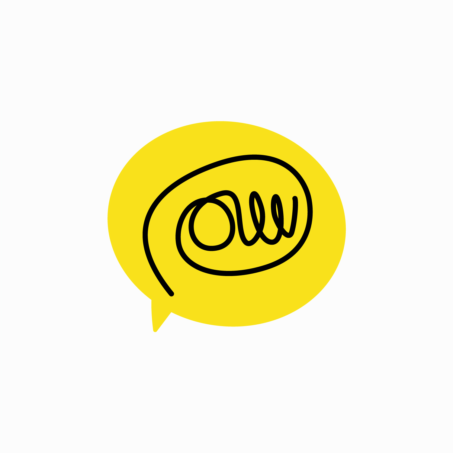
This identity is an example of a brand that is born full of symbolism and a high dose of emotion: the handwritten lettering, and in particular the letter O that simulates an eye, was designed by a child. We redesigned it respecting the original feature and developed a sober line in which the icon gains preponderance.