//
What MOVES us is the challenge. The power we apply in designing images and words to inspire and improve lives. This is what we have done in our most recent communication project for STCP – Sociedade de Transportes Coletivos do Porto (Porto Public Transport Society).
With more than 150 years of history and a unique legacy, STCP developed its Organizational Culture Identity by identifying the 5 pillars of the company’s DNA to create a structured support base for more than 1,300 workers. The challenge we faced was to create a simple, yet inspiring and impactful internal communication brand that would generate a feeling of pride and belonging to the STCP tribe, in addition to translating the brand’s mission: Taking people further.
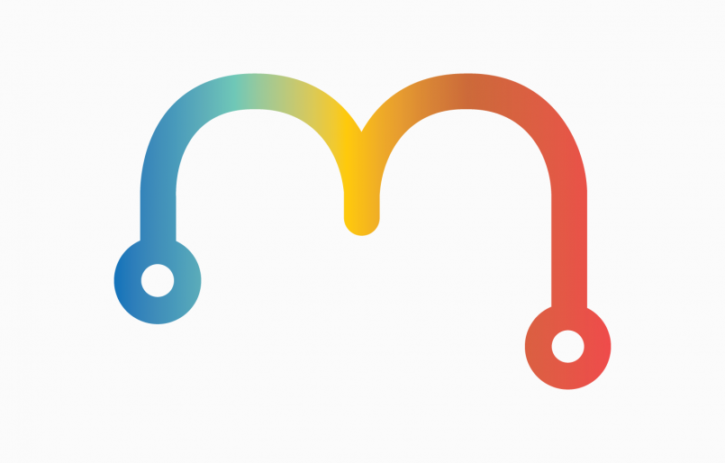
MOBES was the chosen name and the graphic representation of the logo is originated from the STCP isolated icon as an individual in constant mobility between the starting and the finishing point. The 5 colors rainbow represent each Culture pillar: Vision, Mission, Values, Manifesto and Mantra. And for MOBES language we took the words of Almeida Garrett: “If in this city there are many people who exchange B for V, there are very few who exchange honor for infamy and freedom for servitude.” We adopted the “B” of Porto and a direct and accessible language, with typical expressions of the people of the North – “Very noble, always loyal and undefeated”- who live in constant mobility through the streets of Porto.
The brand activation took place in an atmosphere of party and celebration at the first MOBES festival, with all the workers enjoying social interaction. In addition to the Cultural Identity Manual and the decoration of spaces at the Headquarters and Via Norte Garage, we reinforced the visual and vivid explanation of the brand and its values through the production of an inspiring video that involved the participation of several teams of workers who participated as actors.
This video summarizes the message across all the communication: STCP’s engine is in people, using the energy they radiate through mobility. TAKING YOU FURTHER is the claim and mission of MOBES brand. It is also our mission.
What MOVES you?
//
What MOVES us is the challenge. The power we apply in designing images and words to inspire and improve lives. This is what we have done in our most recent communication project for STCP – Sociedade de Transportes Coletivos do Porto (Porto Public Transport Society).
With more than 150 years of history and a unique legacy, STCP developed its Organizational Culture Identity by identifying the 5 pillars of the company’s DNA to create a structured support base for more than 1,300 workers. The challenge we faced was to create a simple, yet inspiring and impactful internal communication brand that would generate a feeling of pride and belonging to the STCP tribe, in addition to translating the brand’s mission: Taking people further.
MOBES was the chosen name and the graphic representation of the logo is originated from the STCP isolated icon as an individual in constant mobility between the starting and the finishing point. The 5 colors rainbow represent each Culture pillar: Vision, Mission, Values, Manifesto and Mantra. And for MOBES language we took the words of Almeida Garrett: “If in this city there are many people who exchange B for V, there are very few who exchange honor for infamy and freedom for servitude.” We adopted the “B” of Porto and a direct and accessible language, with typical expressions of the people of the North – “Very noble, always loyal and undefeated”- who live in constant mobility through the streets of Porto.
The brand activation took place in an atmosphere of party and celebration at the first MOBES festival, with all the workers enjoying social interaction. In addition to the Cultural Identity Manual and the decoration of spaces at the Headquarters and Via Norte Garage, we reinforced the visual and vivid explanation of the brand and its values through the production of an inspiring video that involved the participation of several teams of workers who participated as actors.
This video summarizes the message across all the communication: STCP’s engine is in people, using the energy they radiate through mobility. TAKING YOU FURTHER is the claim and mission of MOBES brand. It is also our mission.
What MOVES you?
Livingroup is a Real Estate investment company that has conquered the international market through a dynamic commitment between quality and innovation. The icon we developed for the brand is composed of two buildings that come together to form not only the brand initials, Living and Group, but also give it the urban character of construction and architecture, associated with the business. The rectilinear lines of the logo demonstrate solidity and confidence, while the parity between the black and green colors give the brand’s mood a modern and luxurious classicism.
Nafta is a women’s brand with Portuguese and Italian production, which combines the good taste and experience of the two countries in the manufacturing of knitwear and clothing in modern and comfortable fabrics. The hot and bright sun was the icon chosen to represent the spirit of the brand, so we developed a brightly colored sun, in an unlikely mix of hot pink and orange. The overlapping straight lines cause an optical illusion of movement.
Piece of Work is a Cowork brand that aims to be innovative, seeing the individual as a unique piece, part of a shared universe with the same mission – to be and work happily. To communicate the sharing of ideas and energy as the brand’s DNA, we created a speech icon with the signature POW. With a sustainability goal, the various materials developed for the brand were designed for a mostly digital use, as in the space’s instruction manual. The printed materials, such as the stationery or the brochure, were made with recycled paper.
The code is complex in its execution, but simple in its iconography. It is a digital language that allows communication between humans and machines. With this inspiration, we created an uncomplicated identity, using programming symbols that together form the KODLY logo icon. In the color palette, we opted for green for its youthfulness and freshness and black for its sobriety, applied to simple and modern designs, with a strong image that represents the company’s responsiveness. We explored the branding through the stationery, brochures and flyers, gifts, walls/roll-ups and communication for a personalized Christmas offer.
EPOC is a low impact HIIT (High Intensity Interval Training) class, which results in very few injuries and is scientifically proven to be the best method for losing calories. It works the entire body and uses cutting edge technology to measure individual performances. Since the brand’s goal is to offer its customers a different experience, we have created a modern image that inspires exclusivity. The 4 letters distributed in a square accentuate these dynamics of club and movement and the tones of the brand reinforce the distinctive style (black) and the energy of intense training (bright yellow). The images of physical exercise in black and white, with bars crossed in yellow, are worked under the claim Challenge Yourself and aim to transmit powerful concepts of movement, rhythm and motivation, appealing to the practice of an innovative physical exercise.
To be a notary is to exercise the law with public faith, so you must have an image that communicates authenticity, trust, official power and elegance. Cláudia Barbas is a brand with a classic and handwritten signature, in a direct reference to the basis of a notary’s work (contracts signature), and also to the founder’s personal stamp. The sober colors, matte gold and blue gray, in conjunction with the rich textures of special papers, add elegance and refinement to the brand’s presentation.
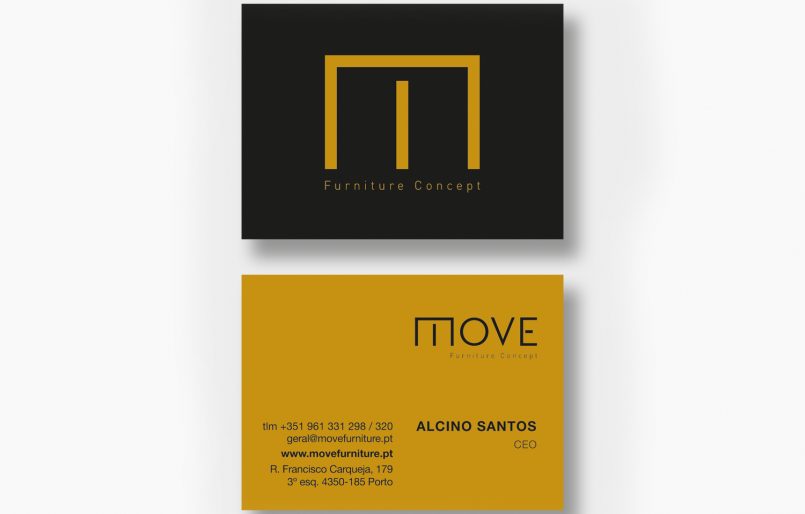
Move is the abbreviation for the word “móvel” (furniture) in Portuguese and with a double meaning in English. It is also short for the word movable. This way we reconciled the company’s dynamism, which has been operating in the market for 60 years, moved by the passion of all who have worked there and making the manufacture of furniture something more than a simple production: a life purpose that MOVES them.
This identity is an example of a brand that is born full of symbolism and a high dose of emotion: the handwritten lettering, and in particular the letter O that simulates an eye, was designed by a child. We redesigned it respecting the original feature and developed a sober line in which the icon gains preponderance.