

QUINTINO
O sonho que percorre gerações.
Situada em Vila Real, ENCANTOS DA QUINTA é uma quinta com mais de 100 anos, habitada pela família Assunção há várias gerações. Com cerca de 5 hectares, começaram uma plantação de vinhas que, sendo uma atividade agrícola comum da região do país, nada mais natural que se tornar num sonho de Quintino Assunção, um homem muito querido e conhecido por todos como TI QUINTINO.
Agora, a sobrinha neta e as suas filhas, criam a empresa ENCANTOS DA QUINTA com o objetivo de realizar este sonho antigo, que agora também é delas: criar uma marca própria de vinhos que honra o fundador — QUINTINO.
A família Assunção apresentou-nos este projeto e colocou-nos a seguinte proposta: criar a identidade visual da empresa ENCANTOS DA QUINTA e da marca de vinhos QUINTINO, respeitando todo o seu legado e história de família.
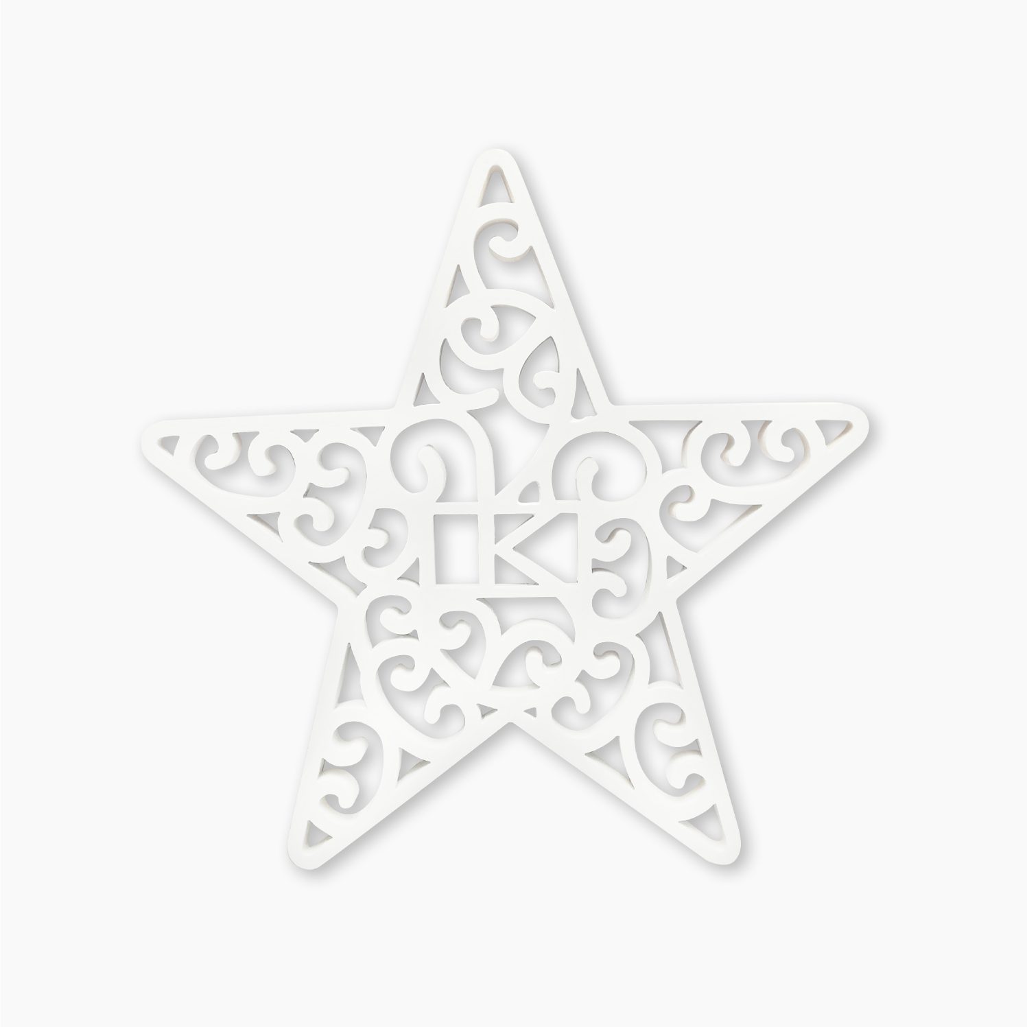
Inspirado na Quinta, criamos o ícone onde unimos os dois nomes começados pela mesma letra Q com os traços das vinhas no interior. Para o logotipo da marca QUINTINO, em homenagem a Quintino Assunção, redesenhamos a sua impressão digital e assinatura, e criamos os 3 rótulos, rolhas e cápsulas da gama de Vinhos QUINTINO: White, Red e Reserva 2020.
//
What MOVES us is the challenge. The power we apply in designing images and words to inspire and improve lives. This is what we have done in our most recent communication project for STCP – Sociedade de Transportes Coletivos do Porto (Porto Public Transport Society).
With more than 150 years of history and a unique legacy, STCP developed its Organizational Culture Identity by identifying the 5 pillars of the company’s DNA to create a structured support base for more than 1,300 workers. The challenge we faced was to create a simple, yet inspiring and impactful internal communication brand that would generate a feeling of pride and belonging to the STCP tribe, in addition to translating the brand’s mission: Taking people further.
MOBES was the chosen name and the graphic representation of the logo is originated from the STCP isolated icon as an individual in constant mobility between the starting and the finishing point. The 5 colors rainbow represent each Culture pillar: Vision, Mission, Values, Manifesto and Mantra. And for MOBES language we took the words of Almeida Garrett: “If in this city there are many people who exchange B for V, there are very few who exchange honor for infamy and freedom for servitude.” We adopted the “B” of Porto and a direct and accessible language, with typical expressions of the people of the North – “Very noble, always loyal and undefeated”- who live in constant mobility through the streets of Porto.
The brand activation took place in an atmosphere of party and celebration at the first MOBES festival, with all the workers enjoying social interaction. In addition to the Cultural Identity Manual and the decoration of spaces at the Headquarters and Via Norte Garage, we reinforced the visual and vivid explanation of the brand and its values through the production of an inspiring video that involved the participation of several teams of workers who participated as actors.
This video summarizes the message across all the communication: STCP’s engine is in people, using the energy they radiate through mobility. TAKING YOU FURTHER is the claim and mission of MOBES brand. It is also our mission.
What MOVES you?